Journal · Photography
Photographing colour-heavy architecture without flattening it
Terracotta, teal and olive can turn into a mood board in a photograph. The fix is to let the geometry lead.
By Afinity Media ·

Strongly coloured buildings photograph beautifully and badly at the same time. Beautifully, because the colour is the first thing anyone sees. Badly, because the camera tends to turn a three-dimensional composition of planes into a flat swatch.
Start with the plan, not the palette
We look for the moments where the architecture does something colour cannot: an arch that frames a view, a niche that steps back, a parapet that curves into a wall. Those are the frames that hold the building together.
Use light to separate planes
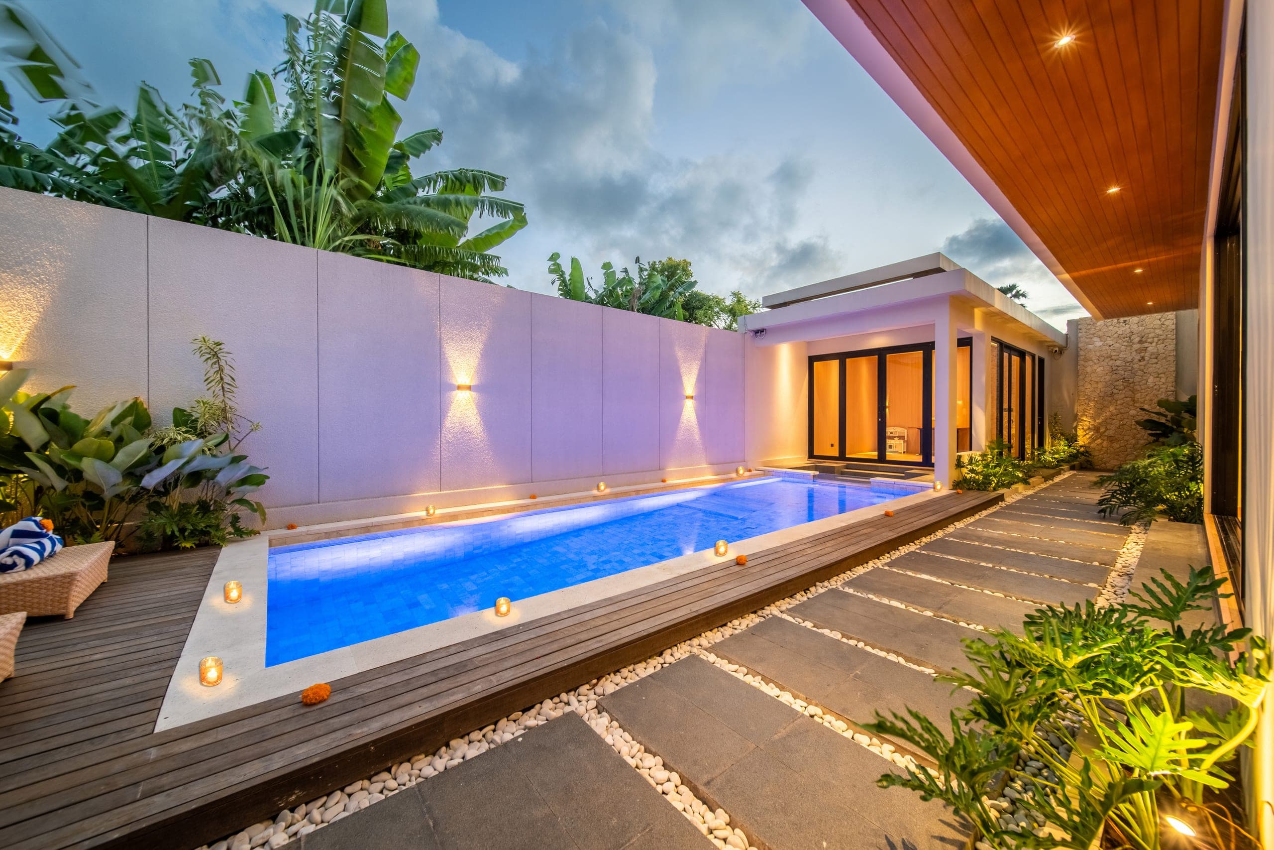
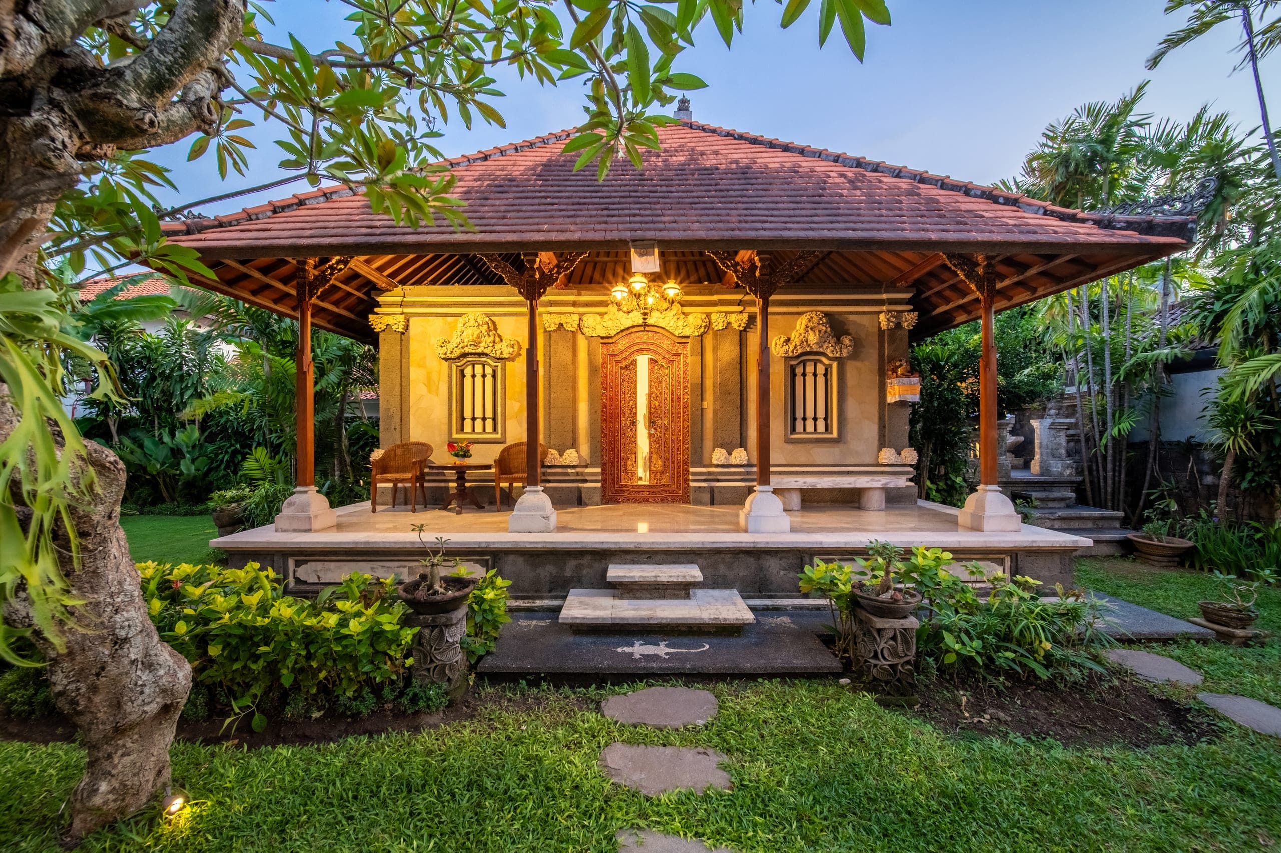
Two walls of the same terracotta read as one wall until the light hits them differently. Morning and late-afternoon sun, and the glow of interior lights at blue hour, do the separating for you. Midday flat light is where colour-heavy buildings go to look cheap.
Do not correct the colour away
The temptation in post is to pull saturation back to look sophisticated. Do not. The client chose that terracotta on purpose. Keep it accurate to what stood in front of the lens, and let the composition do the work of making it feel considered.