Journal · Web
An architect's website should load before it impresses
Slow, heavy portfolio sites lose the visitor before the first image appears. Fast image delivery is a design decision, not a technical afterthought.
By Afinity Media ·
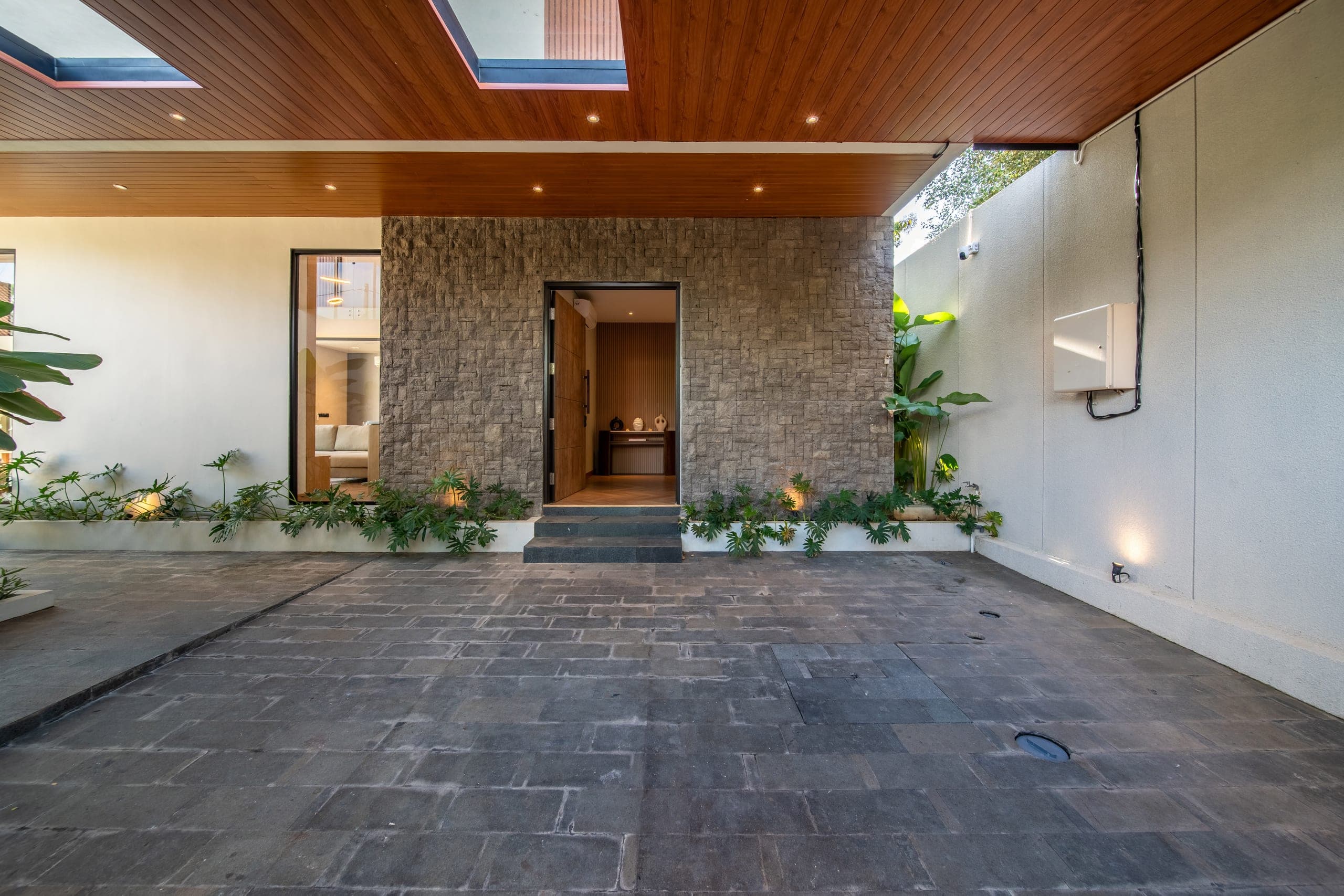
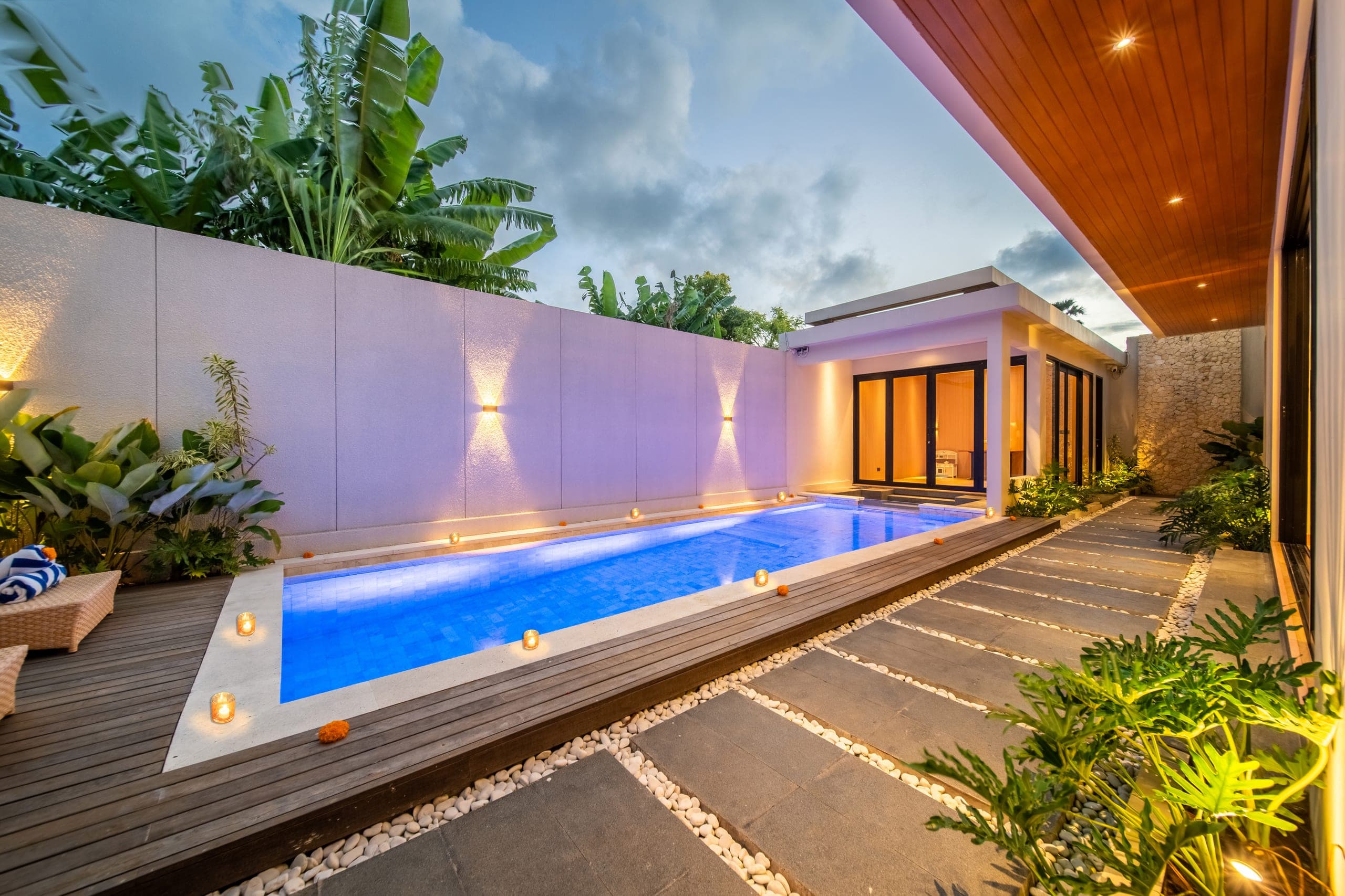
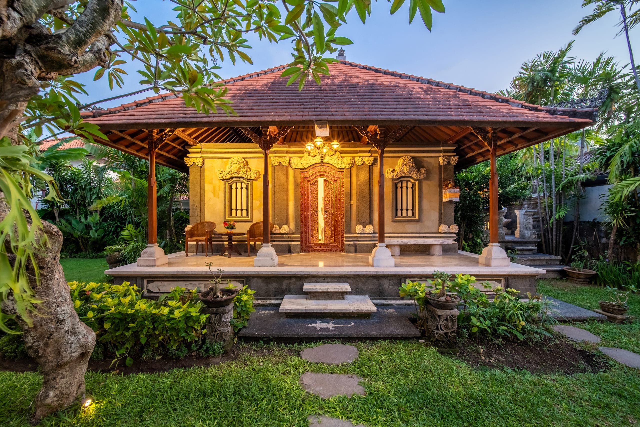
Most architecture and property websites are an image gallery with a menu. That makes image delivery the whole job, and it is where most of them quietly fail.
The first image is the first impression
If the hero takes four seconds to arrive on a phone, the visitor has already formed an opinion, and it is not about your work. A good build ships the right size of image for each screen, in a modern format, with a tiny blurred preview so the layout never jumps.
Fewer, larger, better
A portfolio of forty small thumbnails tells the visitor that everything is equally important. A portfolio of six well-sequenced projects, each opening into a full-bleed gallery, tells them what you want to be hired for.
Make the next step obvious
Every page should end with one clear action. For a studio selling work to developers and architects, that is almost always a short conversation. Put the booking link where the visitor's attention already is, and keep the form to the fields you genuinely need.
None of this is glamorous. All of it is the difference between a site that gets forwarded to a partner and one that gets closed.